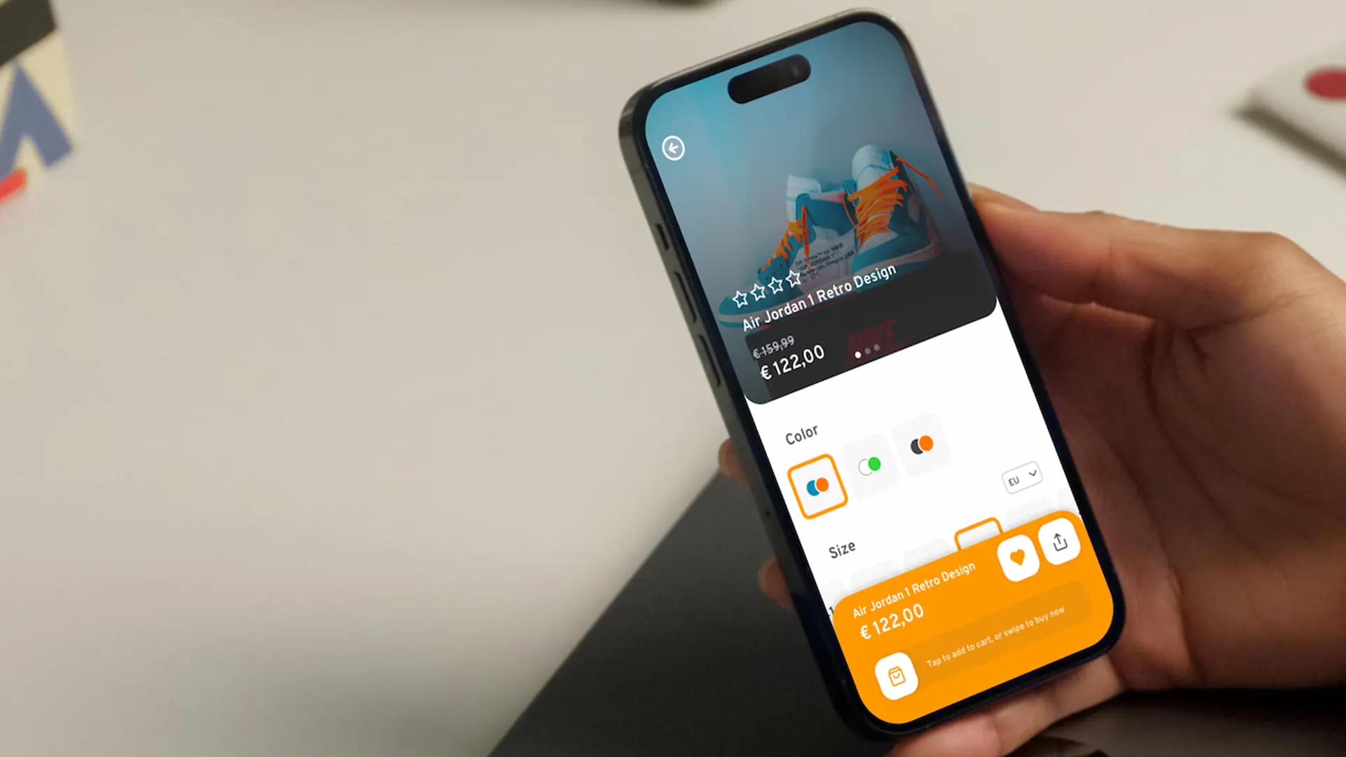
Improve the experience and modernize the UI. I wanted to modernize the app, making it clearer and easier to understand. On mobile, many sections felt crowded: filters weren't immediately visible, product cards mixed too much information, and the checkout flow lacked guidance.
The goal was to simplify what matters, highlight useful parts, and hide the superfluous - so users reach the cart and checkout with fewer steps and less confusion.
Amazon's app is powerful but dense. Years of feature additions have created an interface that often overwhelms. The challenge was stripping away complexity while preserving full functionality - making the shopping experience feel fast, clear, and trustworthy.
Two target users guided the design: frequent buyers who want to quickly find products and complete purchases without unnecessary steps, and explorers who browse to get ideas and need clear categories and simple suggestions.
Principles: Quick, more organized filters. Essential information highlighted in cards and product pages. Cart bar that accompanies the user with simple guidance. Wishlists always easily accessible.
Structure: The home is cleaner and highlights entry points to main categories. In lists, filters remain visible and easy to use. Less useful sections are secondary to avoid distracting the user. On product pages, information is organized and important actions are easy to reach. A new shopping experience is offered through the new interactive cart bar.
Design system: Essential colors with an accent for important actions. Legible fonts and consistent sizes. Regular spacing to let content breathe.
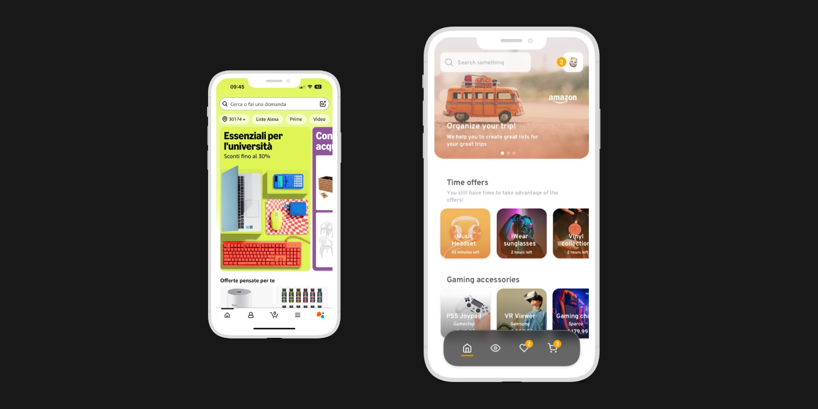
More organized homescreen, with distinct sections. Time-limited and personalized offers added. Quick filters help users find what interests them faster. Navigation always visible with direct access to wishlists.
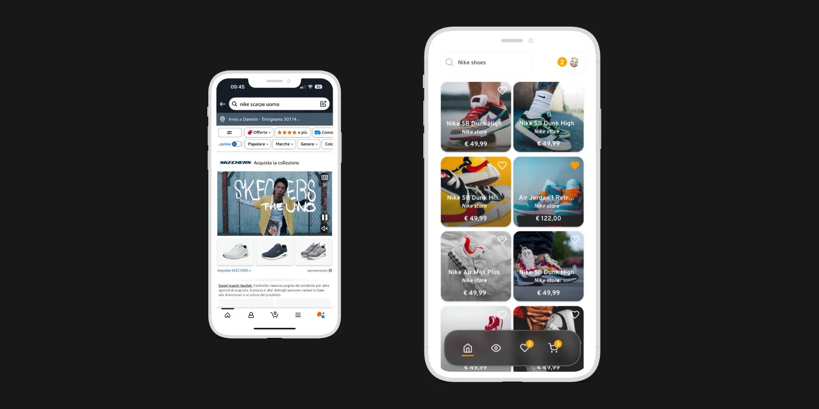
Product cards are clearer: price and offers are immediately understandable. Filters remain visible and easy to use throughout the browsing experience.
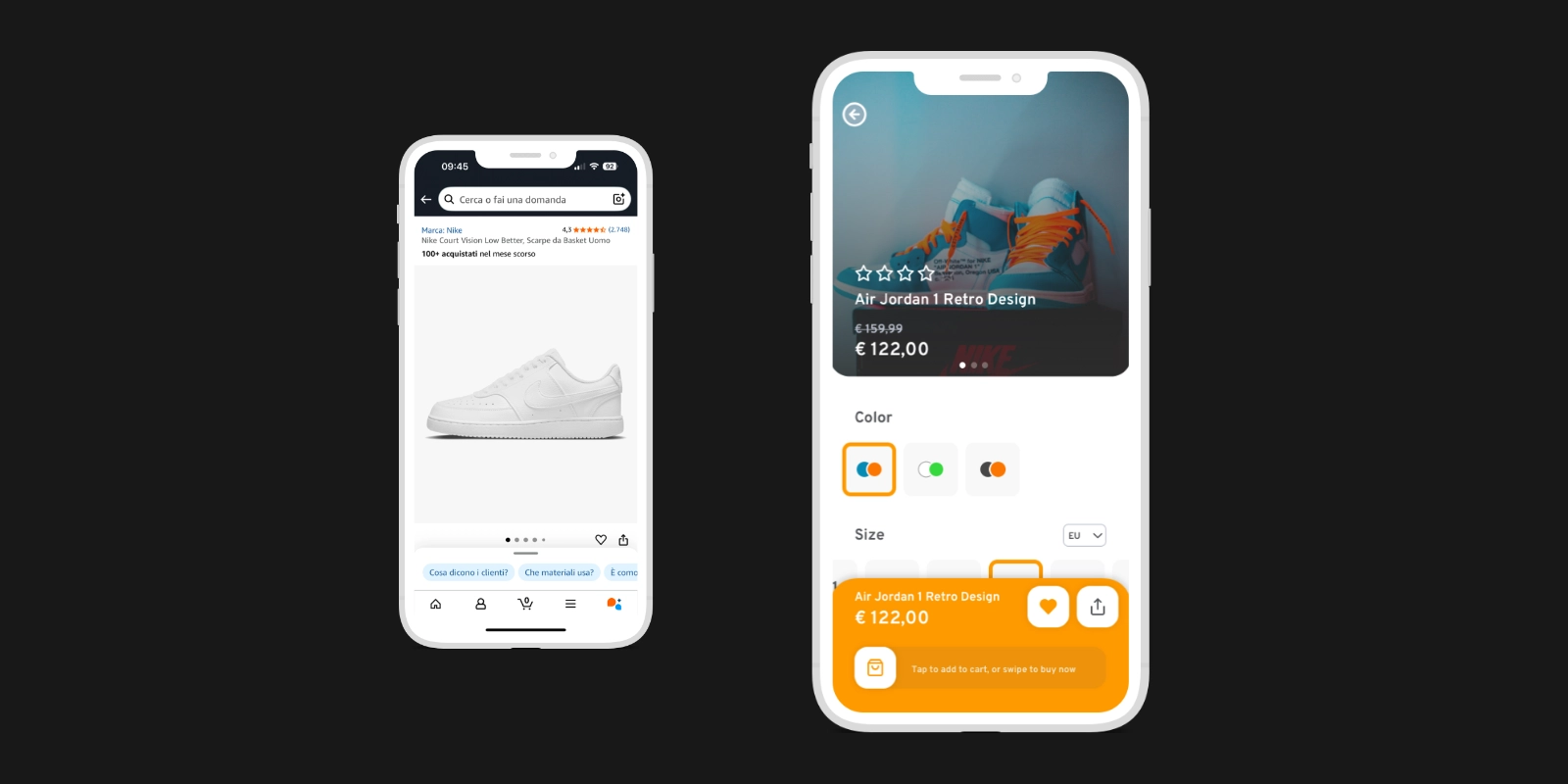
The product detail page has a new, more modern look. It's easier to change filters to search for the product you want. New shopping experience with the Dynamic Purchase Bar: one tap to add to cart, one swipe to buy directly.
New checkout design: more modern, cleaner, easier to understand. The path to cart and checkout is more linear and requires fewer steps.
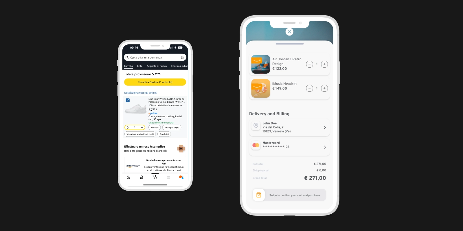
Product search is clearer and faster, with no distracting elements. Cards are more readable: price, offers, and actions are immediately clear. The path to cart and checkout is more linear and requires fewer steps. New shopping experience via the Dynamic Purchase Bar.
Like this project? Let's work together.
Get in touch →