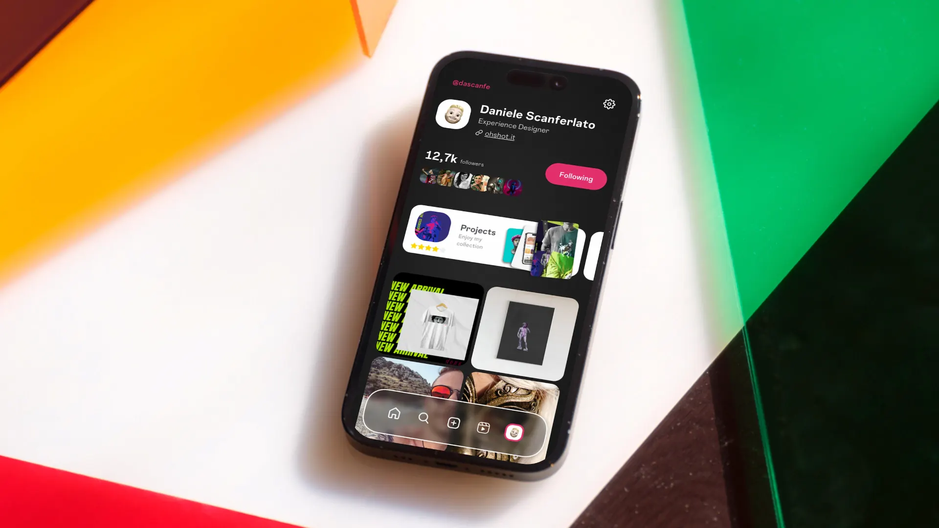
UI modernization and improved usability. Make Instagram simpler and faster to use through a cleaner, more modern interface - putting the quality of content back at the center.
Instagram's current UI prioritizes engagement metrics over content quality. Infinite scroll, algorithmic noise, and feature bloat make it hard for users to find what matters. The challenge was redesigning key screens to shift the balance toward meaningful interactions - without removing the features that make the platform powerful.
Two distinct user types guided the design:
What I worked on:
Principles: Visual interface modernization. Reduced visual noise to let content take center stage. A more intuitive navigation with clear tabs and primary actions always within reach.
Structure: Cleaner feed and redesigned navigation bar. Light color palette with recognizable accents, modern typography, and improved spacing.
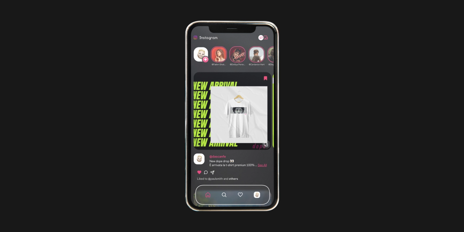
A cleaner, content-focused home screen enabled by the new Hidden Navigation Experience. Navigation bar and header slide out of view to keep the focus on content - fewer distractions, reduced risk of accidental taps.
Redesigned navigation, better integrated within the app. Updated visual language with more contemporary layouts.
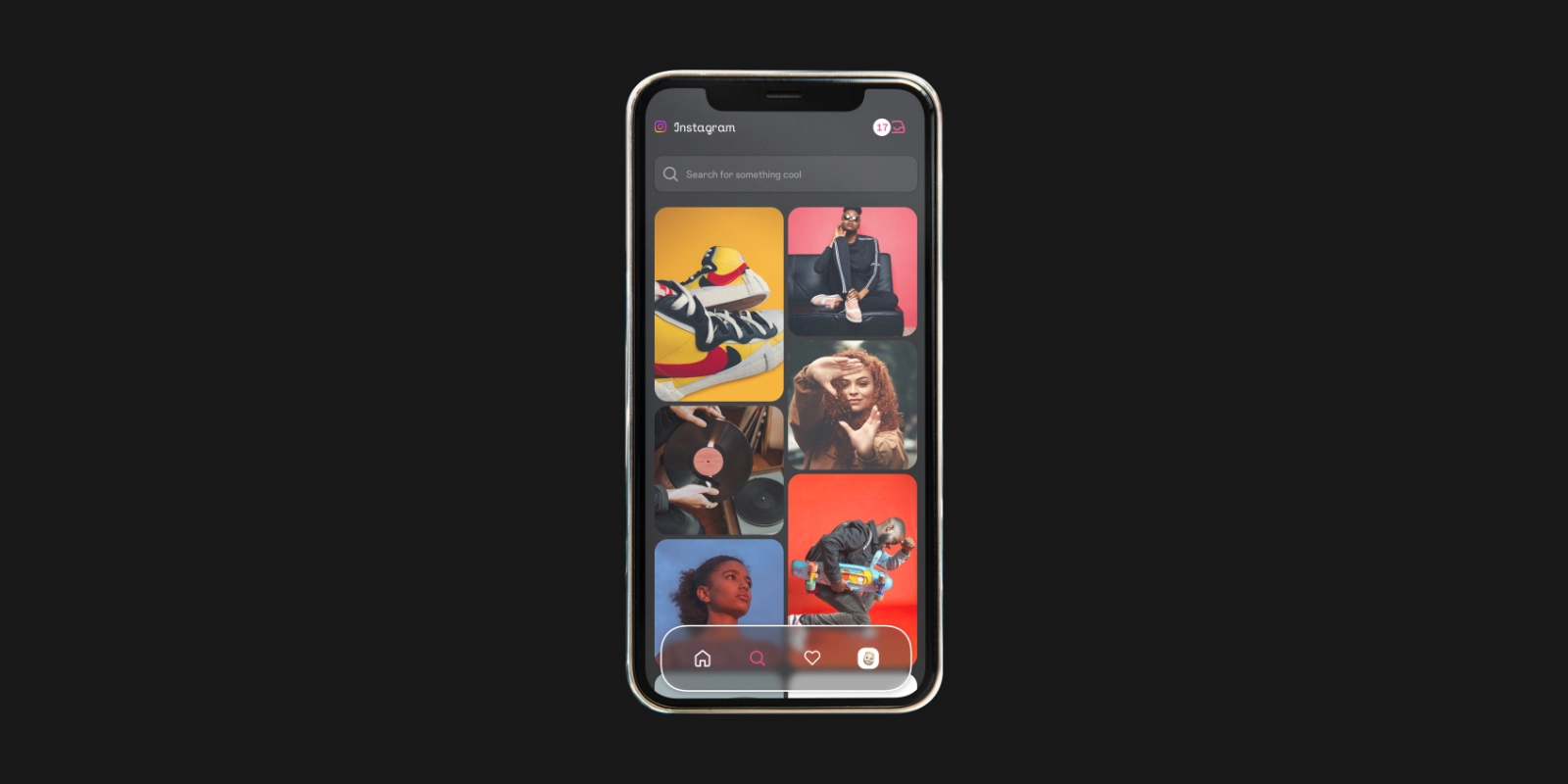
A simplified search experience with fewer, clearer elements. The redesign removes visual clutter and surfaces the most relevant content immediately.
Simplified user profile layout. A dedicated promotional area allowing users to highlight their projects - giving creators more control over how they present their work.
Like this project? Let's work together.
Get in touch →