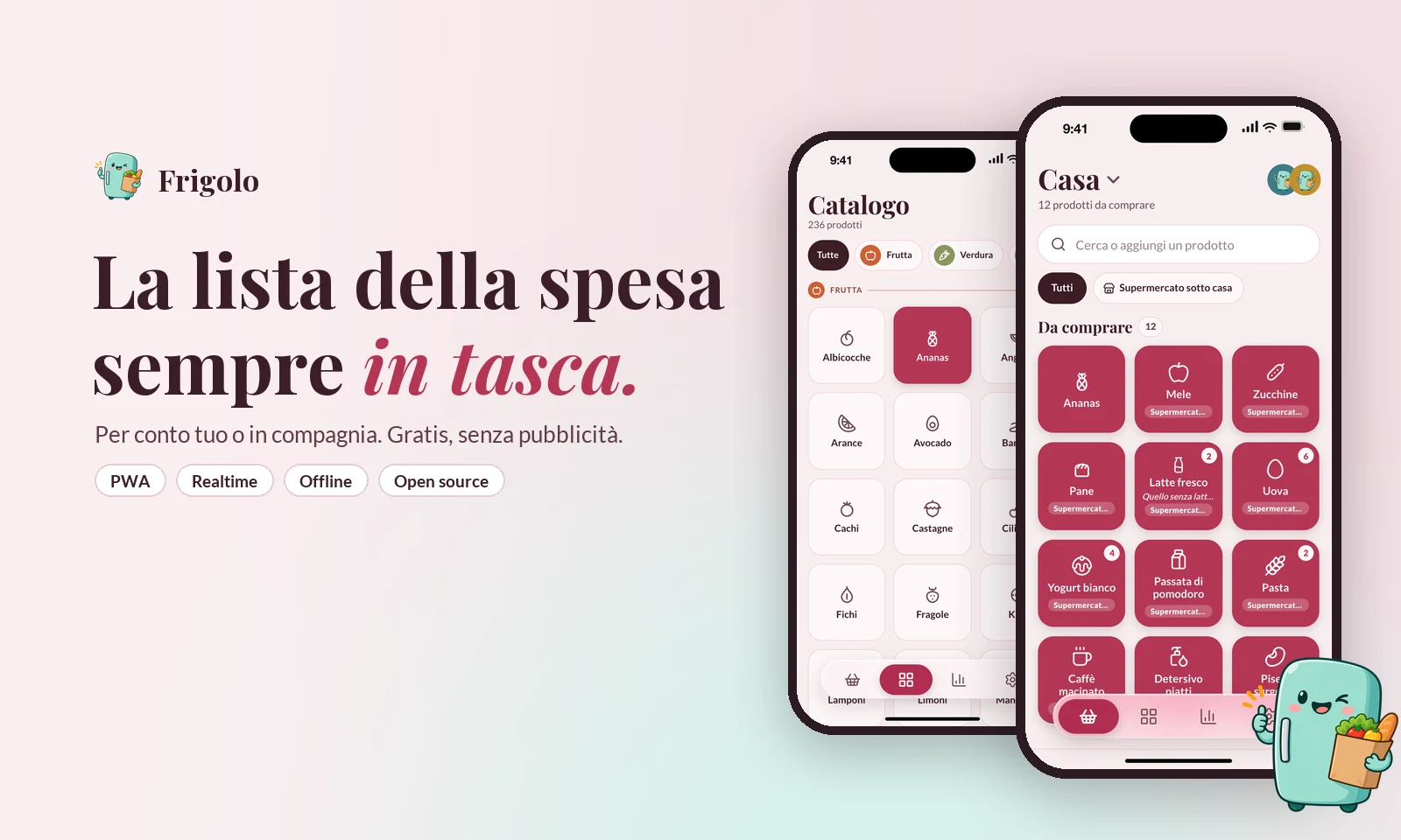
It started with the milk. At home our shopping list lived in a WhatsApp chat, and every week the milk got lost in it: written on Monday, buried by Wednesday, forgotten at the till. As a designer, I couldn't leave it alone.
Frigolo is the shopping list I designed and built for the two of us - and then opened to everyone. One tap and a product is on the list, on every phone of the people you shop with, already in the order you walk the supermarket.
It had two lives. Three weeks as a private tool we used every day, then the question changed: if it works for us, why not for anyone? On 10 October 2026 Frigolo became a public, free, ad-free, open-source app, installable from a link. I ran it end to end - product, design, code, launch - leading a team of AI agents.
A shopping list is the simplest app there is, and almost every one of them gets something wrong. The gap was concrete:
So the design problem was not "make a list". It was make the list disappear: one tap at home, zero thinking in the aisle.
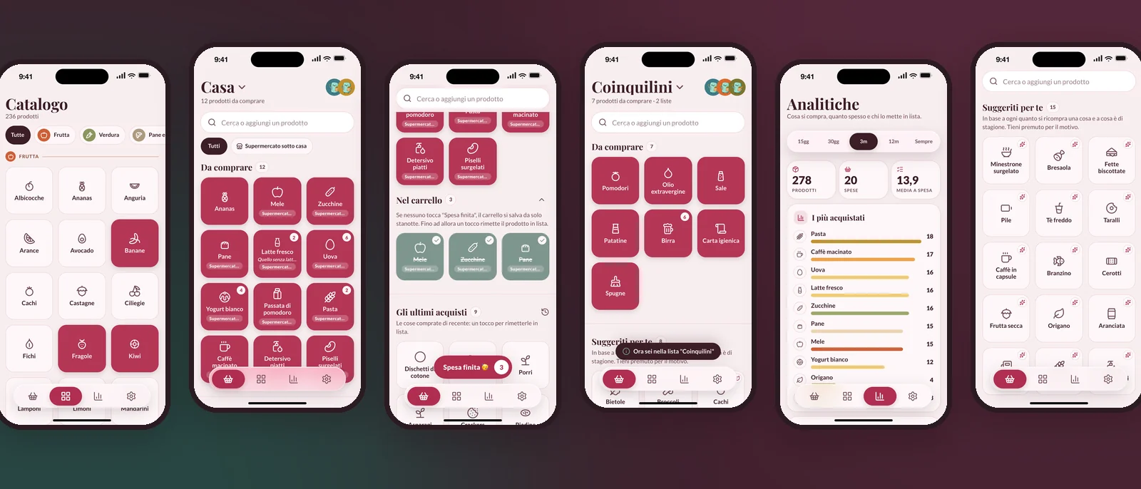
A catalogue, not a keyboard. More than 230 products as a grid of icons, by category. Tap adds, tap again removes; quantity, a note and the store live on the tile itself. Whatever you create joins your catalogue. The keyboard is the exception, not the way in.
The list follows your feet. Items are not shown in the order you added them but in the order you walk: fruit and vegetables first, then bread, the deli counter, the fridge, the shelves, drinks, home and hygiene - and frozen food last, so it stays frozen.
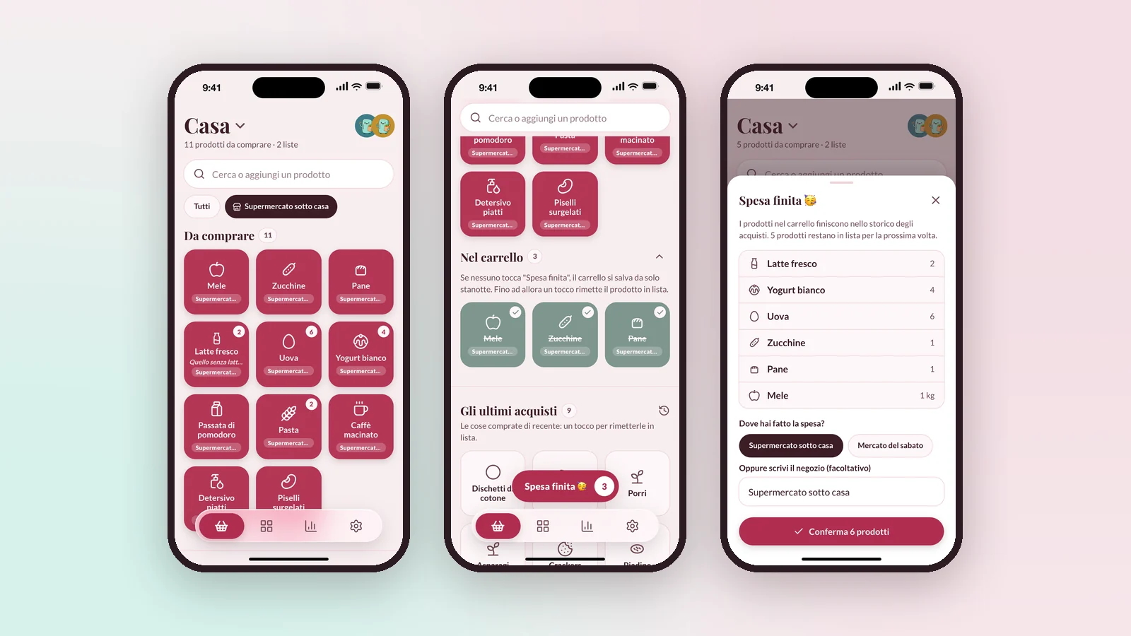
A cart that closes itself. In the store a tap moves a product to the cart; "Spesa finita" (shopping done) closes the trip, asks where you shopped and saves it to history. If nobody taps it, the cart saves itself overnight. Suggestions learn from how often you buy something and what is in season - long press to see why.
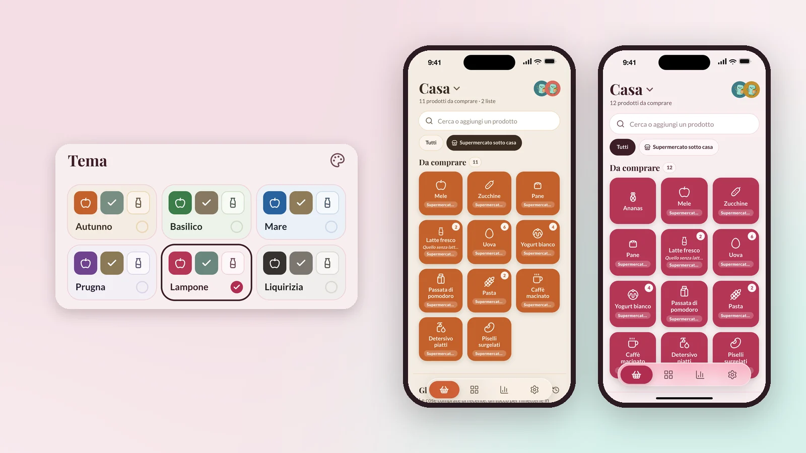
Design system: Playfair Display for titles, Lato for the interface, six token-driven themes - Autumn, Basil, Sea, Plum, Raspberry, Liquorice. Text fields never go below 16px, because iPhone zooms the whole page on anything smaller - and that rule is enforced by a test, not by memory. The voice is the mascot's: a mint fridge called Frigolo, who speaks little, like the app.
The private Frigolo had two users and no strangers. Opening it meant designing everything a personal tool never needs:
I didn't build the public Frigolo alone, and not with a team of people either. I ran it with seven AI agents, each with a role, a folder and a notebook to read before every task and update after it: backend and deploy, frontend and landing, data, strategy, copy and community, visuals and video, QA, security and privacy - coordinated by a project-manager agent.
My role was the one that doesn't delegate: deciding, designing, reviewing. The rules were written before the first line of code. Nothing goes public without my yes - not a push, a deploy, an FTP upload, a post or an email. Database changes are tested locally first and reviewed by QA. Every decision lands in a log, with its reason.
In ten days the public repository went from its first commit to 160. What changes is the job: the bottleneck is no longer writing the code, it is knowing what good looks like - and saying no to everything else.
Frigolo counts without cookies: the landing uses the same cookie-less analytics I built for this site, the app keeps only aggregate counters per day. Two days after sign-ups opened, the numbers said something uncomfortable: only 56% of new users added a single product, and 1 list in 17 was shared.
An empty list is a blank page, and a blank page is where people leave. So the first use was redesigned: the empty list now offers nine everyday products one tap away, the first product gets a small celebration, and only then - once - Frigolo suggests sharing the list. It went live on 20 October. The next reading will say whether it worked; the point is that the question now has a number.
A real product, live and public: installable from a link on iPhone and Android, free, no ads, open source under AGPL-3.0, sustained by voluntary "buy me a coffee" donations - and whoever donates gets exactly the same app as whoever doesn't. Around it, everything a launch needs: a landing page, a launch film, a four-week Instagram plan with the posts ready.
The interesting part was not the list. It was designing a whole product as one person, and deciding every day what Frigolo would not do - no prices, no recipes, no push notifications, no promises it can't keep. Design that gets out of the way while you're standing in the aisle.
The whole idea in under a minute, from "who's buying the milk?" to the link that installs the app. Made for the landing and the launch, in Italian like the app - the screens tell the story on their own.
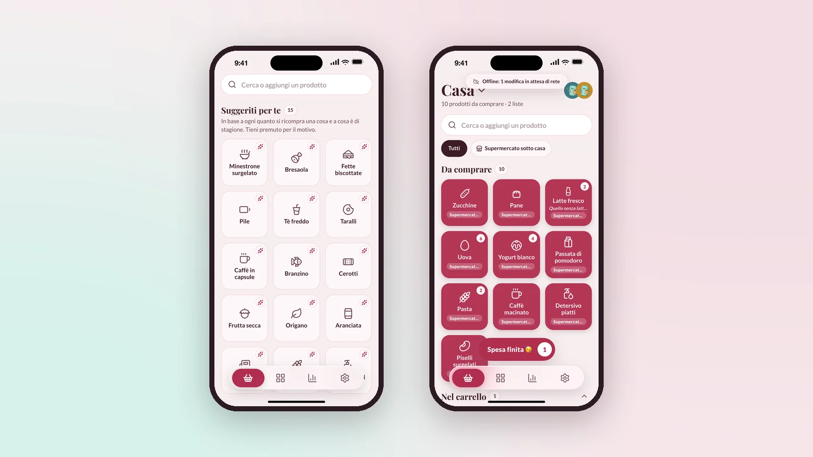
On the left, someone at home taps the pineapple in the catalogue. On the right, the person already at the supermarket sees it appear at the top of the list, in real time. Updates are optimistic: the tile reacts under your finger before the network answers.
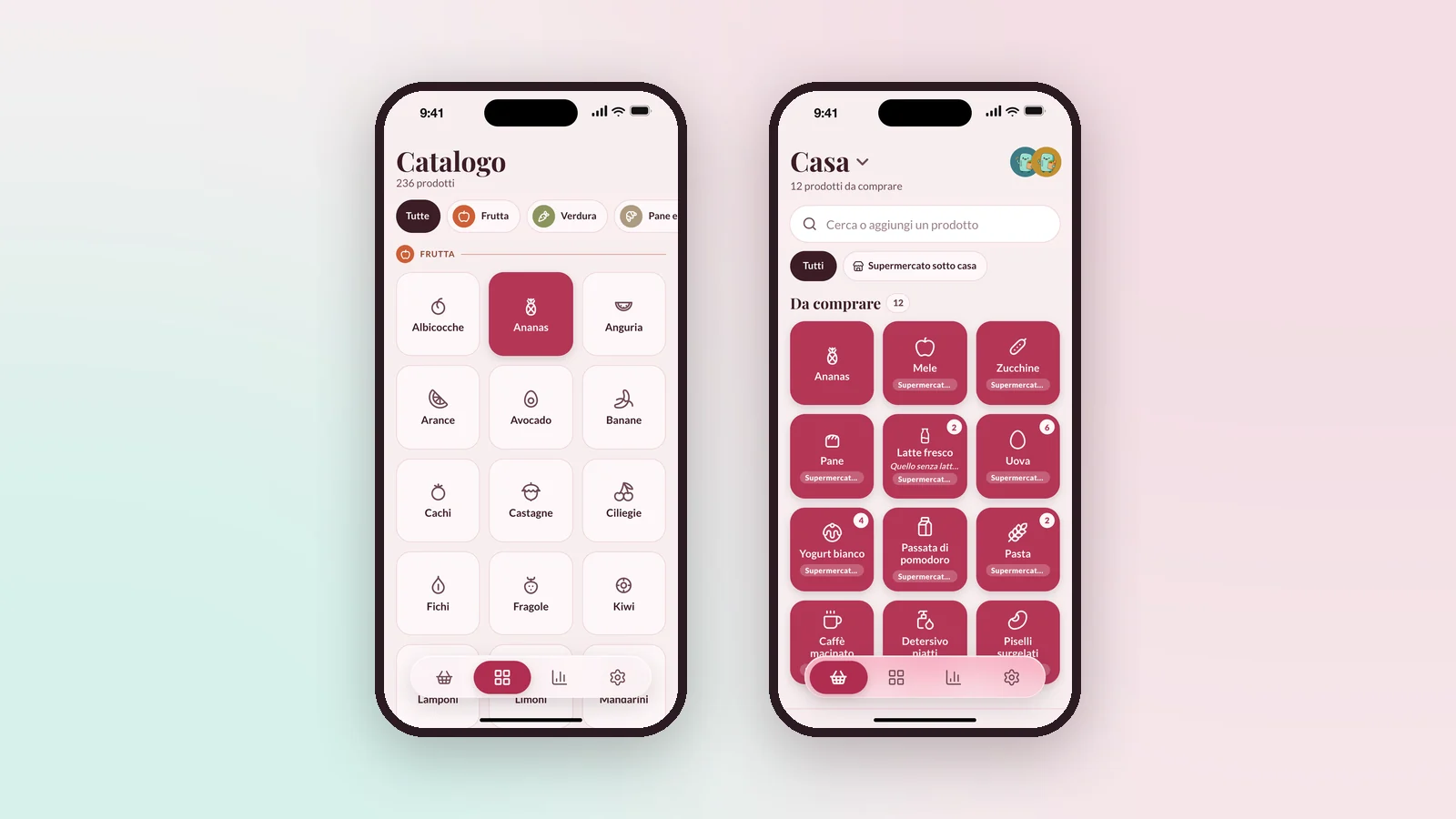
The list in the order you walk, frozen food last. In the store each tap moves a product to the cart below; "Spesa finita" closes the trip, asks where you shopped and keeps the history that feeds the suggestions and the analytics.
One list for home, one for the flatmates. Switching is a tap on the title; inviting is a link sent on WhatsApp, opened with one button. Whoever joins sees the list straight away and can edit it too - no account to configure, no permissions to understand.
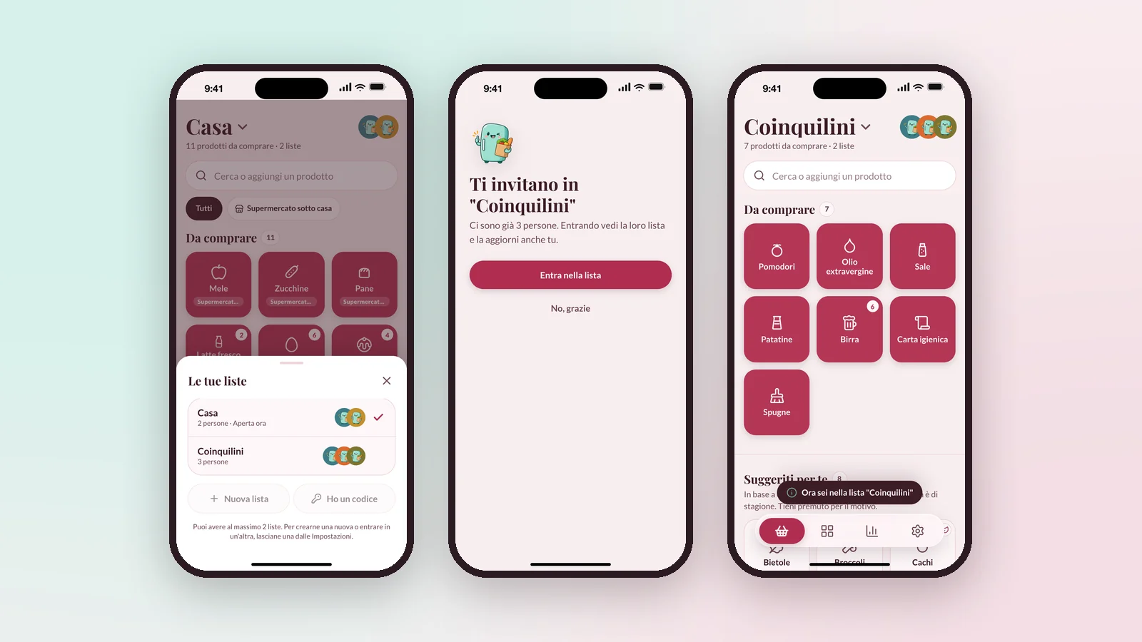
Suggestions come from how often you buy something and from what is in season, and a long press tells you why. With no signal the list stays open and usable; a quiet banner counts the changes waiting, and they leave as soon as the network is back.
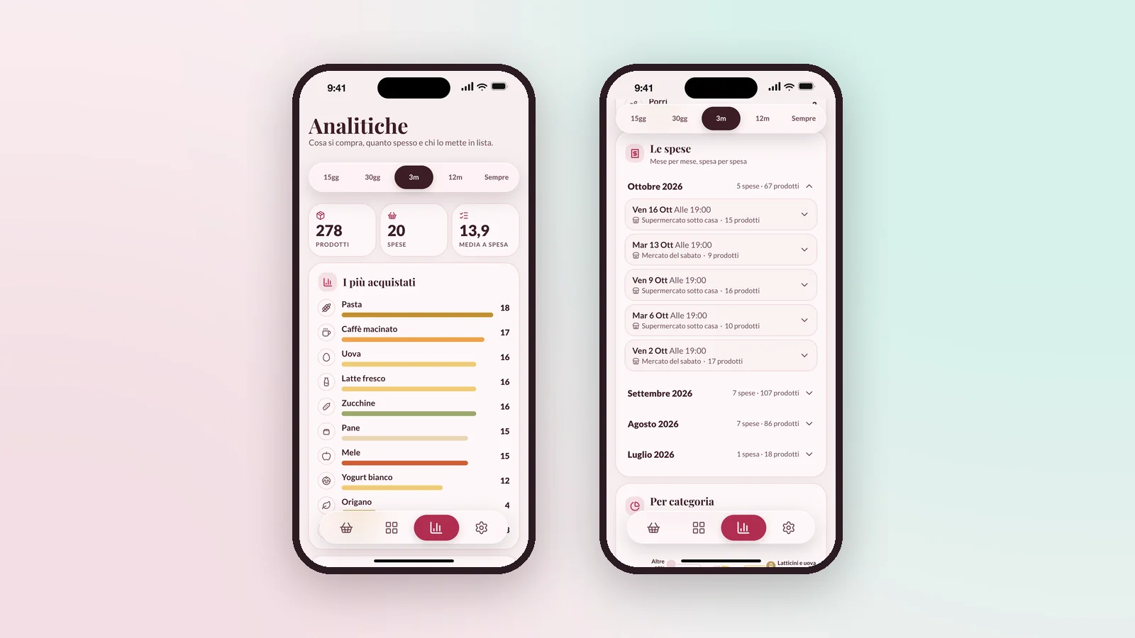
Products and trips over a period, the things you buy most, every past shopping trip by month and by store. It counts what you buy, never what you spend: Frigolo deliberately stays out of prices and budgets.
Autumn, Basil, Sea, Plum, Raspberry and Liquorice: every colour in the app is a token, so a theme is a swap of one layer, not a redesign. Here the same list in Autumn and in Raspberry - the brand colour used for the landing and the launch.
The way it was made is part of the story, so it is told openly: a designer with an everyday problem, a mascot with a name, and a team of AI agents - "I decide and design, they write the code, the copy and the rest. I review all of it."
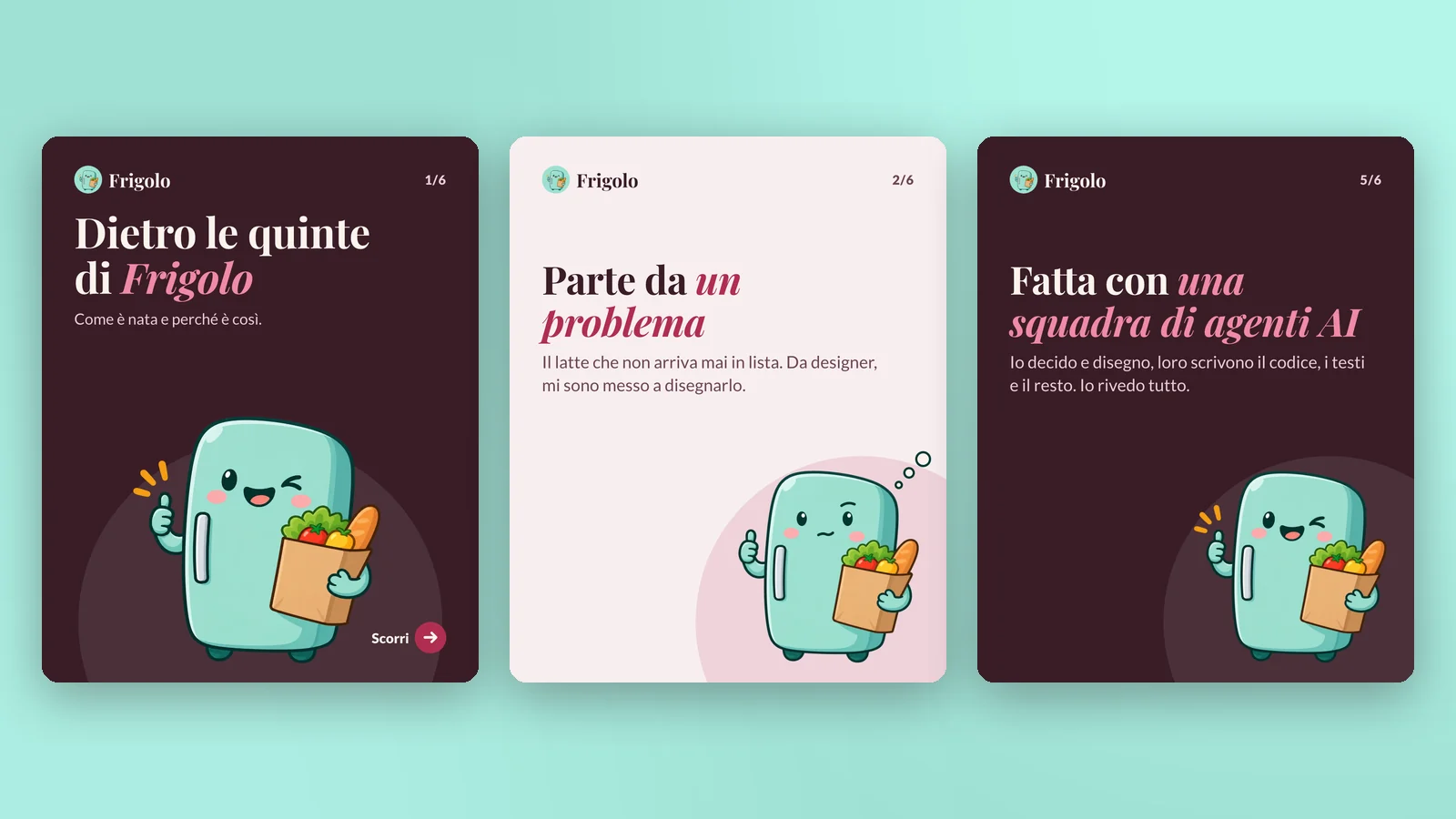
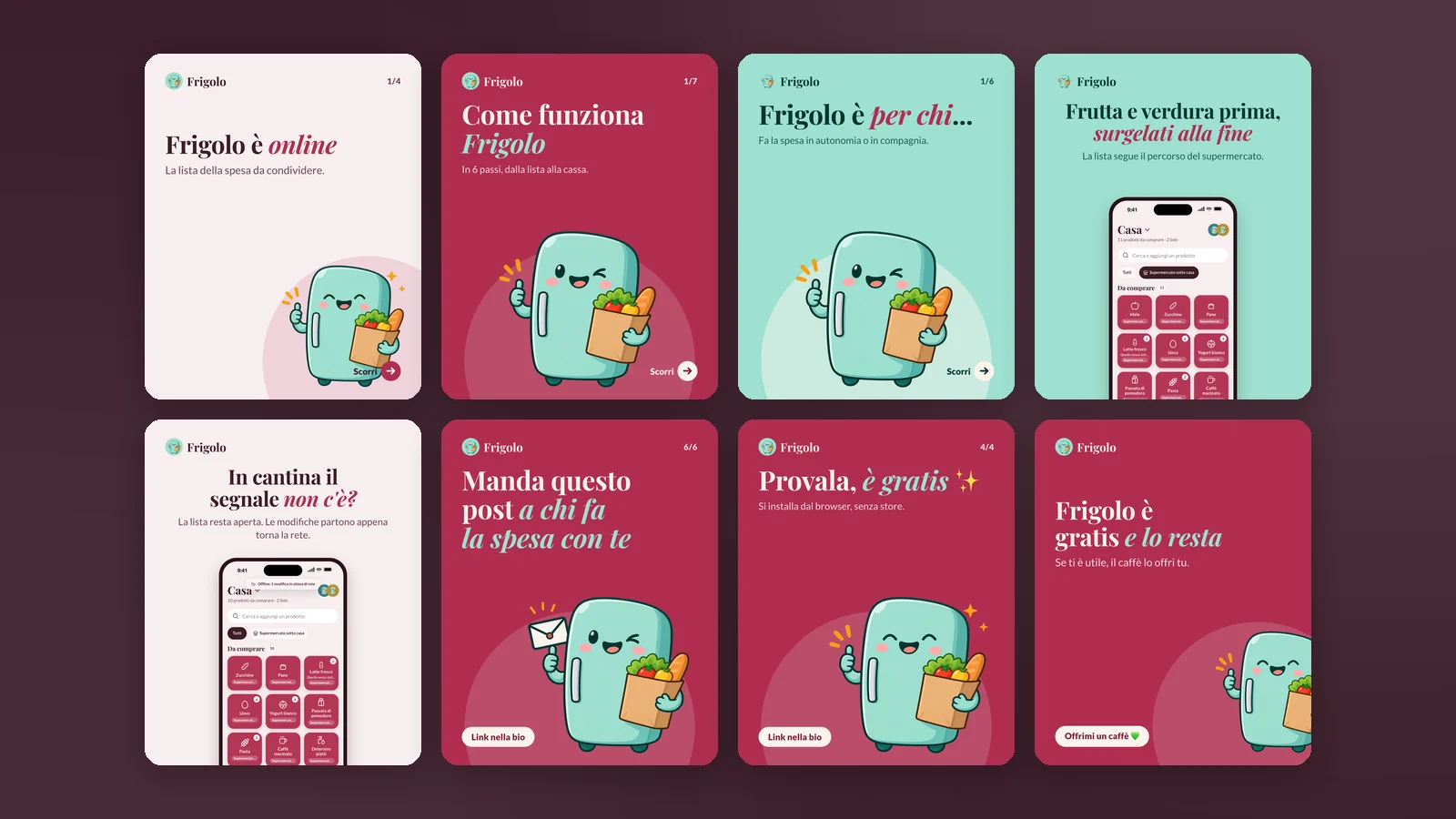
A four-week editorial plan, one message per post: it's online, how it works, who it's for, aisle order, offline, free and staying free. Same mascot, same type, raspberry and mint - a brand that fits in a fridge magnet.
Catalogue, list, cart, shared lists, analytics, suggestions - a small app that does one thing, everywhere you need it, including the one place with no signal.
Like this project? Let's work together.
Get in touch →