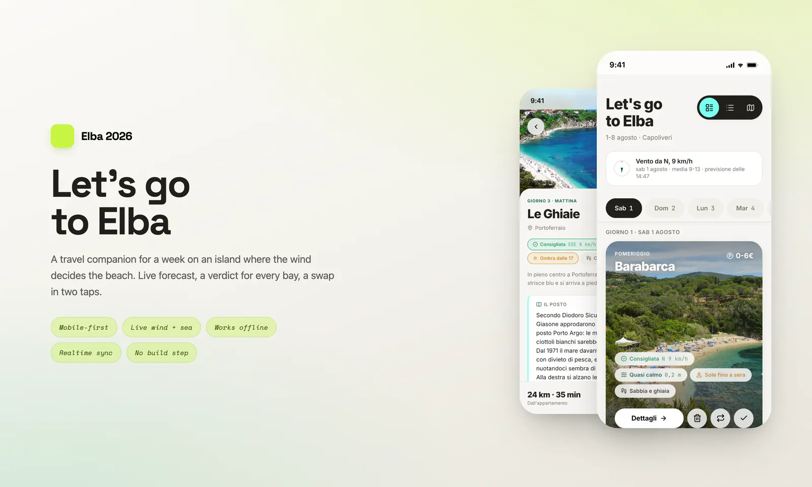
On Elba the wind decides the day. A bay that is perfect on Monday is unusable on Tuesday - waves, cloudy water, seaweed pushed onto the shore - while the one on the opposite coast is glass. We had eight days, an apartment in Capoliveri, a car and an itinerary, and the itinerary had to survive contact with the weather.
Elba 2026 is the app I designed and built for that week. It holds the whole programme, reads the live forecast every morning and tells you, bay by bay, whether today is the day - and if it isn't, which beach to go to instead.
I ran it end to end: field research and dataset, design system, interface, code, hosting. A real product with a small and very demanding user base - the two of us, on a beach, in the sun, with one bar of signal.
Trip planners plan. None of them decides. The gap was concrete:
So the design problem was not "show a forecast". It was turn a forecast into a decision, on a phone, in one hand, in direct August light.
Tokens: a two-tier variable system, primitive to semantic, tuned for the outdoors - sand surfaces in light, ink in dark, lime as the accent, semantic colours for the verdicts. Every colour is a CSS variable: there is not a single hard-coded hex in the components, and the whole app re-themes by swapping the token layer.
Typography: Inter for the interface, JetBrains Mono for the data. The mono is not decoration - it makes wind speeds, minutes and prices line up in a column instead of dancing from row to row.
Rules: a 4px spacing scale, 44px touch targets, AA contrast, and a light theme tuned for the only test that mattered - reading a screen at midday on a beach.
One call to Open-Meteo per session on a point in the middle of the island, plus two sea points north and south for wave height. Not one call per beach: on an island 27 km across the wind is regional, and ten requests would only make the app slower where the signal is worst.
Only the hours between 9 and 13 count - the window in which you actually decide where to go. Speed is a plain average; direction is a vector average. Averaging 350° and 10° arithmetically returns due south, the exact opposite of reality, so the hourly values are summed as sines and cosines and turned back into an angle.
The verdict crosses the wind sector with the exposure of the bay and comes out in four states - recommended, worth checking, not today, calm sea. Every verdict carries its words as well as its colour, because a pill that means something only if you can tell green from amber is a pill that fails in the sun.
Local storage is the source of truth. Ticks, notes, swaps and corrected prices are written to the phone first, instantly, with no network. The forecast is cached with a timestamp: if the request fails the app shows the last reading and says so, and if there is nothing at all the programme still works - only the wind pills go quiet.
Sync sits on top, not underneath. A Supabase table keeps the two phones aligned in real time, one row per changed item rather than one shared document, so two people editing different things never overwrite each other. Offline changes queue up and flush when the signal comes back.
No build step. No npm, no bundler, no framework: four flat files and a favicon, uploaded by FTP. The files you upload are the files that run - which is also why it can be fixed from a phone, on holiday, in five minutes.
A finished mobile app that went on holiday with us: 39 beaches and 2 experiences researched and encoded - exposure, bad wind sectors, sun window, seabed, parking, cost, services - eight days, twelve stops, thirteen evenings, an island map, live wind and sea, light and dark, and a full offline mode.
The interesting part was not the forecast. It was designing a judgement: taking something a local reads in the sky in two seconds and turning it into one line on a screen that a visitor can trust. Design that answers the question you were actually asking.
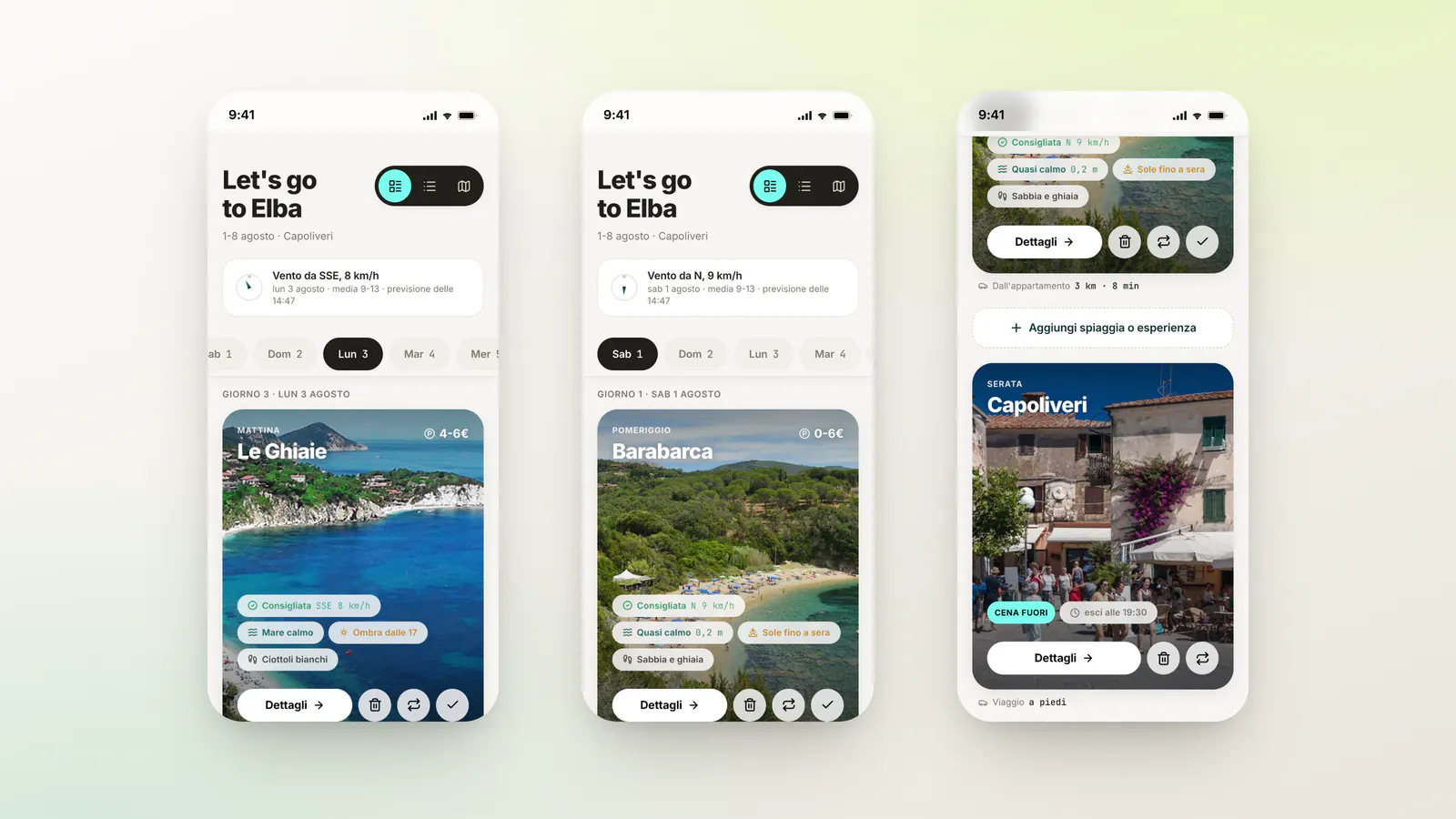
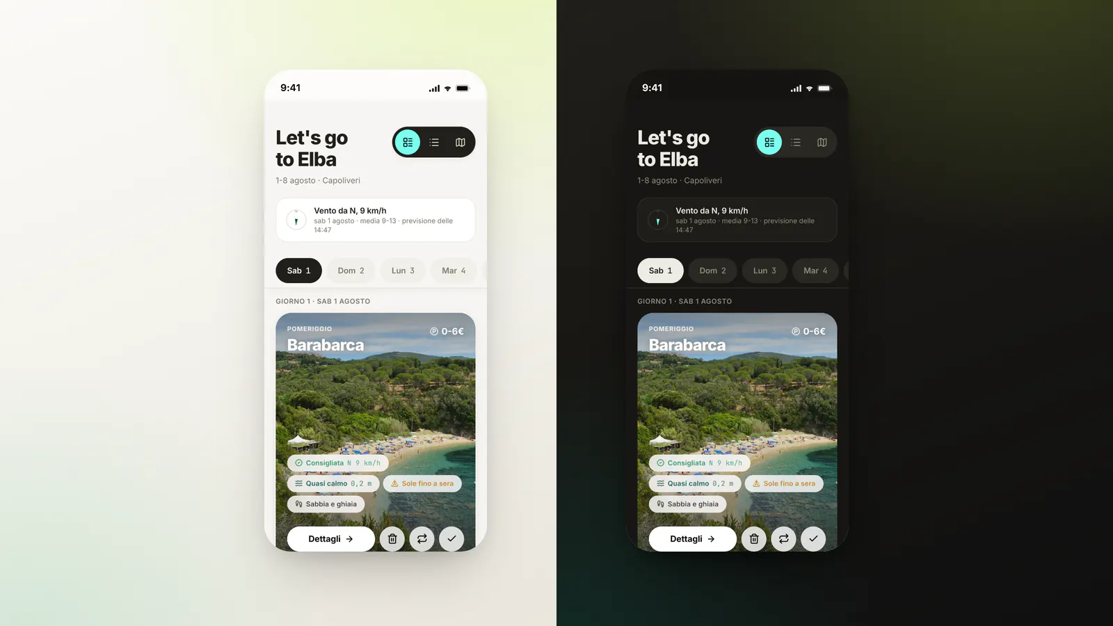
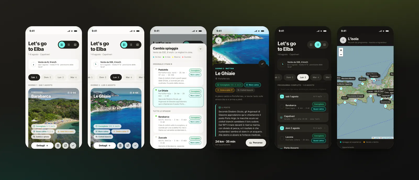
Eight days in a scrollable strip, one card per stop. Each card leads with the place, then the four things that decide your morning: the wind verdict, the state of the sea, the sun window and the cost of parking. Everything else is one tap away.
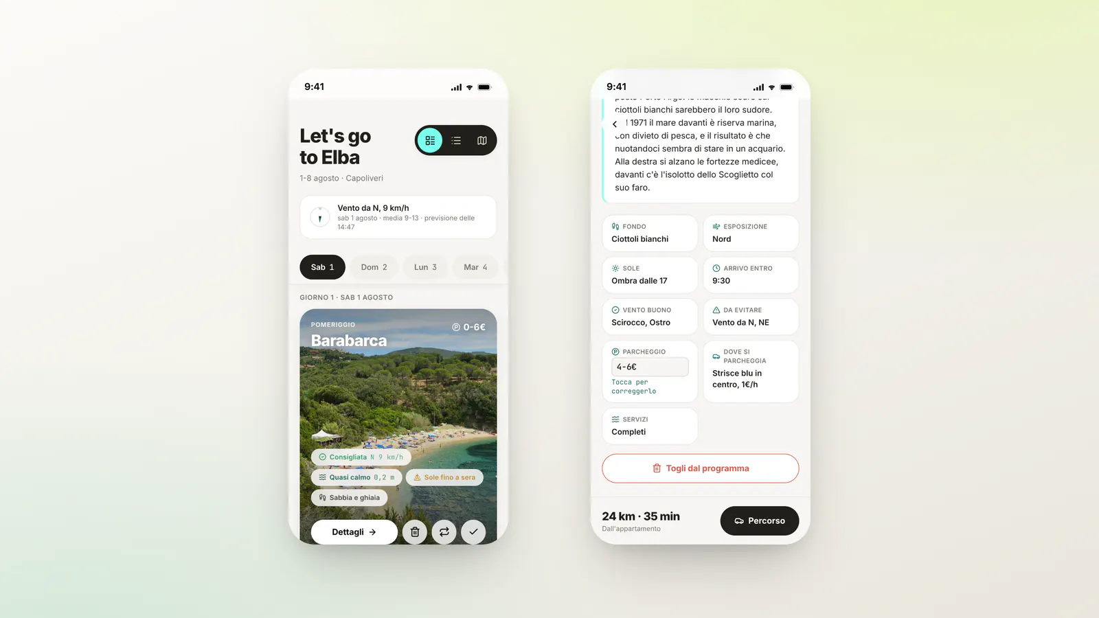
A compass and one sentence at the top: where the wind comes from, how hard, averaged over the hours that matter. Below, the same reading applied to the bay you are about to drive to - which winds it likes, which ones hit it head-on, and how the answer changes today.
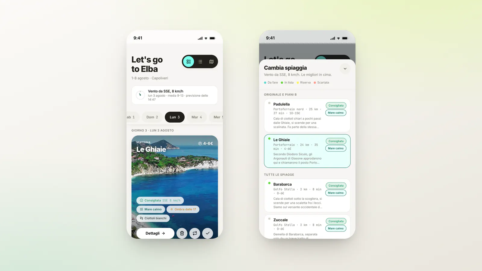
When the plan does not hold, a bottom sheet ranks every beach on the island by today's verdict and then by distance, with the original and its plan Bs pinned at the top. Even the beaches ruled out months earlier stay selectable: with the wrong wind, a rejected bay can become the best call of the day.
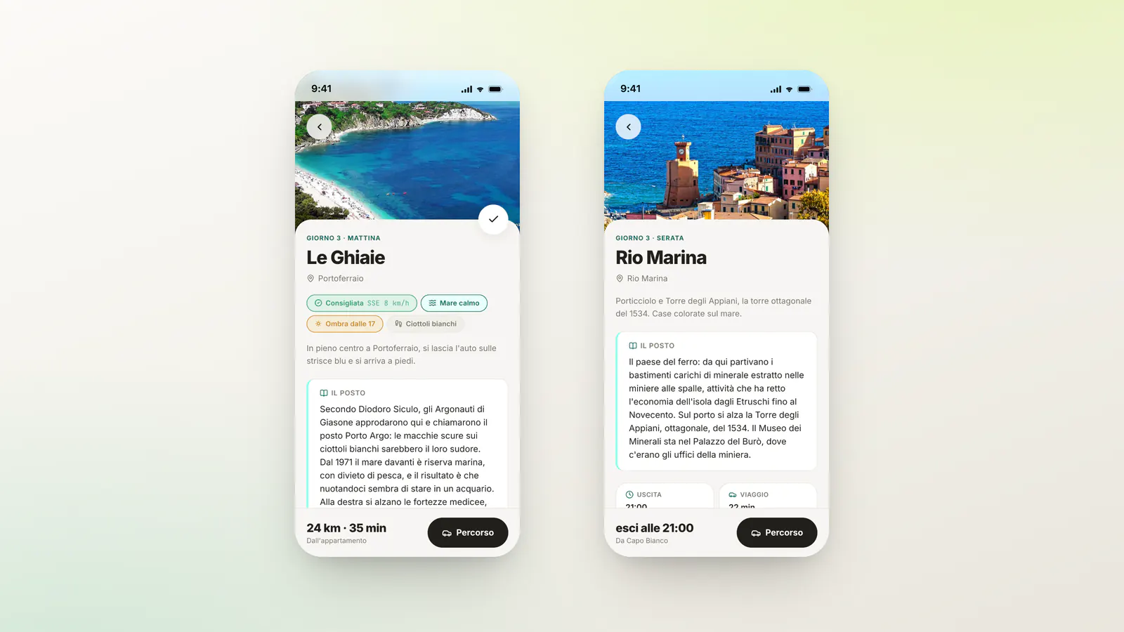
A full page per stop: a photo, the story of the place, the data grid - seabed, exposure, sun, arrive-by, parking, services - a price you can correct on the spot when reality disagrees with the plan, and a route that opens straight into maps. Evenings get the same treatment as beaches.
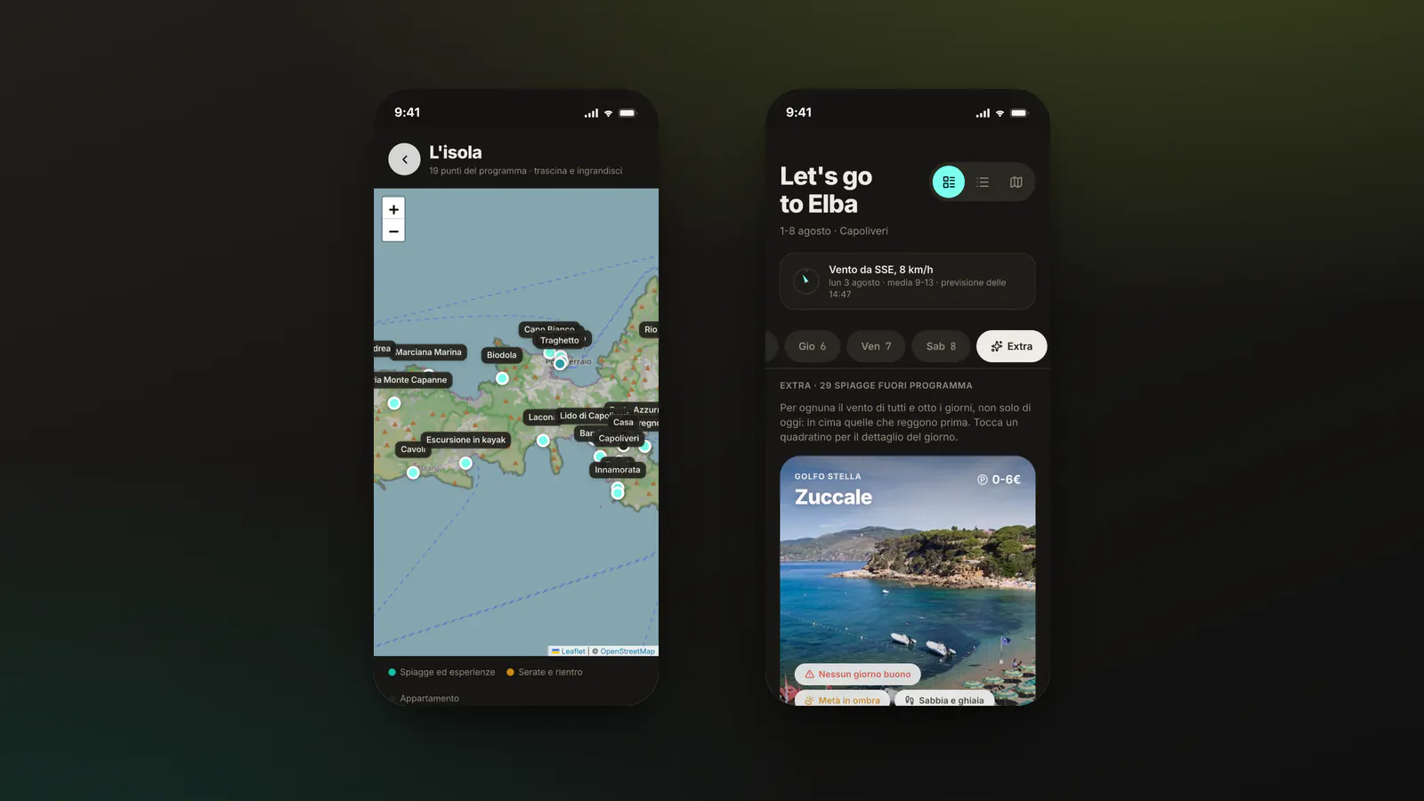
Every stop of the week on one map - beaches, experiences, evenings, the apartment and the ferry - so the shape of the plan is readable at a glance. Next to it, the twenty-nine beaches that never made the programme, each with its own verdict, ready for the day everything changes.
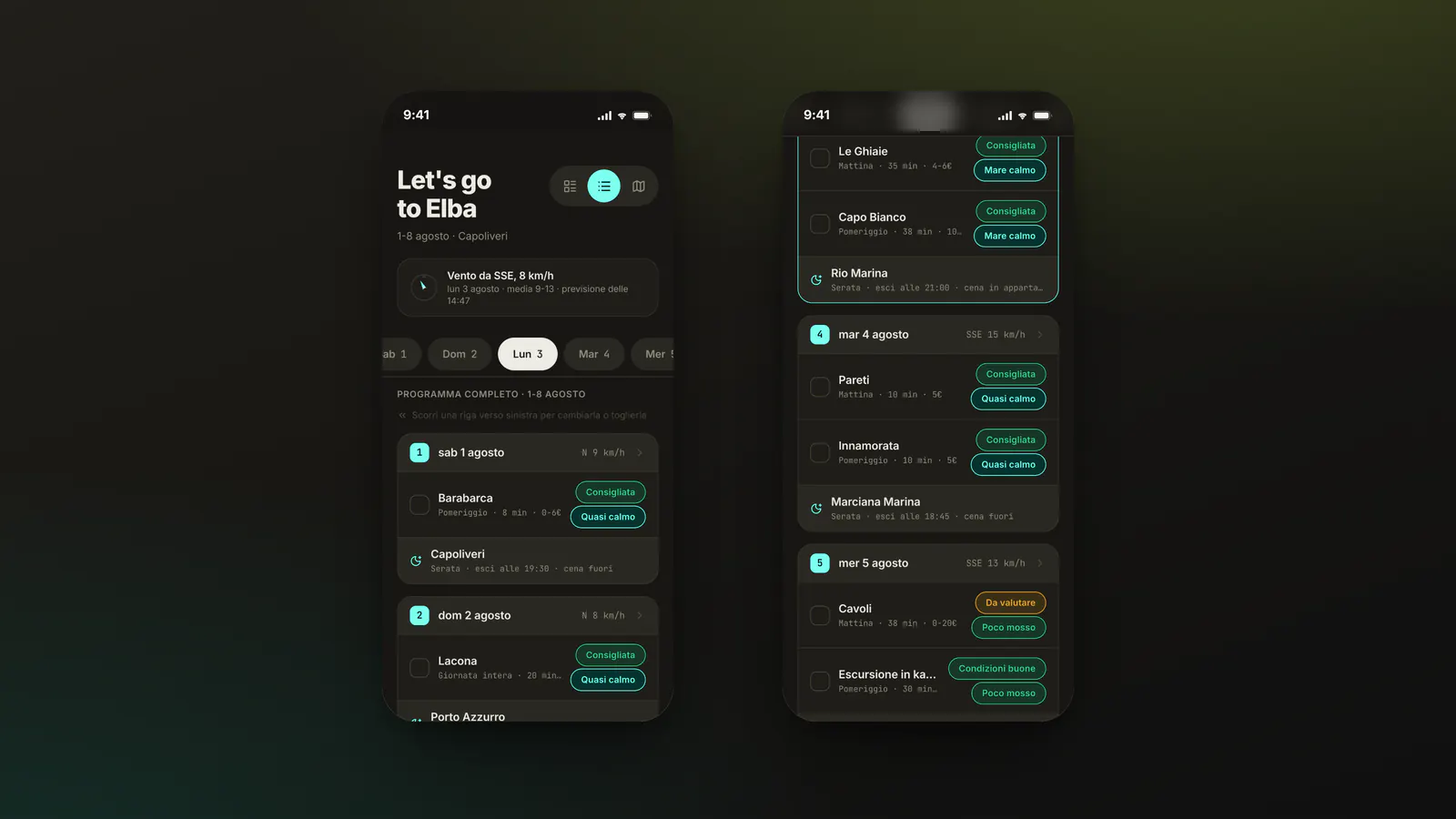
The second view: all eight days in one list, wind and sea on every row, ticks carried across. It is the overview the spreadsheet used to give - without the horizontal scrolling that makes a spreadsheet unusable on a phone.
One system, two themes, driven entirely by tokens. Light is the one that gets used - it is the theme designed for a screen at midday - and dark is what the app switches to on the terrace after dinner. Neither is an afterthought: both were tested on the surface that counts, a phone held at arm's length.
Cards, list, map, detail pages, the swap sheet and the out-of-programme archive - a small, coherent app that does one thing and does it where it is needed, which is outside, with sand on the screen.
Like this project? Let's work together.
Get in touch →