Introduction
In recent years, web design has shifted from focusing on individual pages to building true systems of reusable components. This shift didn't happen by accident - it was driven by the growing complexity of digital products, the need for consistency at scale, and the practical reality of teams working across multiple platforms simultaneously.
Atomic Design, introduced by Brad Frost, gave us a vocabulary and a mental model for this approach. It's become one of the most influential methodologies in modern interface design - and for good reason.
"We're not designing pages. We're designing systems of components."
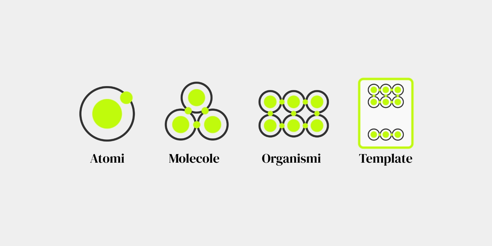
Atoms: the irreducible elements
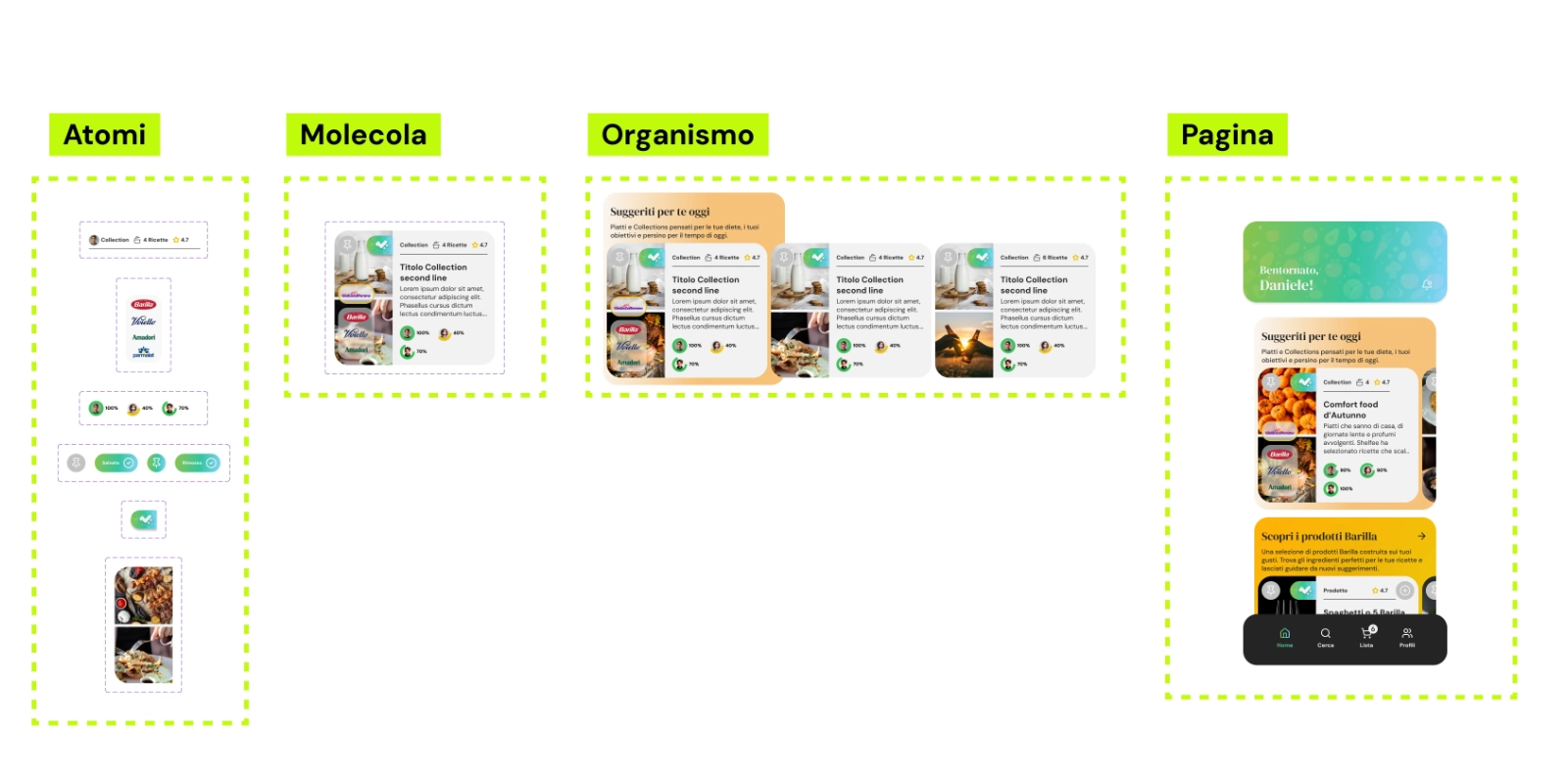
Atoms are the smallest building blocks of an interface - the elements that cannot be broken down further without losing their meaning. A button. A text input. A label. A color. A typographic style. An icon.
On their own, atoms are often not very useful to a user. But they are the foundation of everything else. Defining atoms carefully - their visual properties, their states, their accessibility requirements - is the most important investment a design system can make.
- Typography scales and styles
- Color tokens (primary, secondary, semantic)
- Spacing units
- Individual UI controls (button, input, checkbox)
- Icons and illustrations
Molecules: purposeful combinations
Molecules are groups of atoms that function together as a unit. A search bar is a molecule: it combines an input atom, a button atom, and perhaps a label atom into something with a clear, single purpose.
Molecules are where design starts to become functional. Each molecule should have a clear, singular responsibility - it should do one thing well. This constraint forces clarity and makes components easier to reuse across contexts.
The key question when defining a molecule is: What is this for? If the answer is vague or multiple things, the molecule may need to be split.
Organisms: complex, self-contained sections
Organisms are relatively complex UI components made up of groups of molecules and atoms. A navigation header is an organism: it contains the logo (an atom), navigation links (molecules), and perhaps a search bar (another molecule) and a CTA button.
Organisms are self-contained sections of an interface - chunks of functionality that can stand on their own. They represent distinct sections of a layout and can be reused across different templates while remaining contextually coherent.
"Organisms can exist independently - they contain their own logic, their own state, their own visual completeness."
Templates and Pages: where structure meets content
Templates are page-level objects that place organisms into a layout and demonstrate the design's underlying content structure. They are essentially wireframes that use real components - showing how everything fits together without being tied to specific content.
Pages are then specific instances of templates - with real content. They are where we test whether the system actually works in practice. Real content often reveals flaws that abstract components hide: text that's too long, images that break the layout, edge cases that the template didn't anticipate.
Atomic Design in practice
The power of Atomic Design is not in following the hierarchy rigidly - it's in the mental model it provides for thinking about components at different levels of abstraction. In practice, the boundaries between atoms, molecules, and organisms are often fuzzy and context-dependent. That's fine.
- Start by auditing your existing UI for patterns and inconsistencies
- Define your tokens (colors, typography, spacing) before your components
- Build components with composability in mind - design for reuse
- Document everything: a component without documentation is a component waiting to be misused
- Involve developers from the start - the best design systems are built collaboratively
The biggest mistake teams make when adopting Atomic Design is treating it as a rigid taxonomy. It's better used as a way of thinking - a shared language between designers and developers for discussing the structure of an interface.
Why it matters
A well-built design system based on atomic principles does more than ensure visual consistency. It speeds up design and development, reduces decision fatigue, enables teams to scale without losing coherence, and creates a shared language between disciplines.
More importantly, it shifts the design conversation from "what does this page look like" to "how does this system work" - a much more powerful and durable foundation for building digital products that last.